Candlestick chart is the most useful way to look at the market.
Candlestick chart is what Petko Aleksandrov – Head trader at EA Forex Academy, focuses on in this lecture: Hello dear traders, it is Petko Aleksandrov and I continue now with the different candlestick chart types that we have and the time frames.
The first thing I will go to is the chart types, there are three basic chart types-this is the bar chart, the candlestick chart and the line chart.
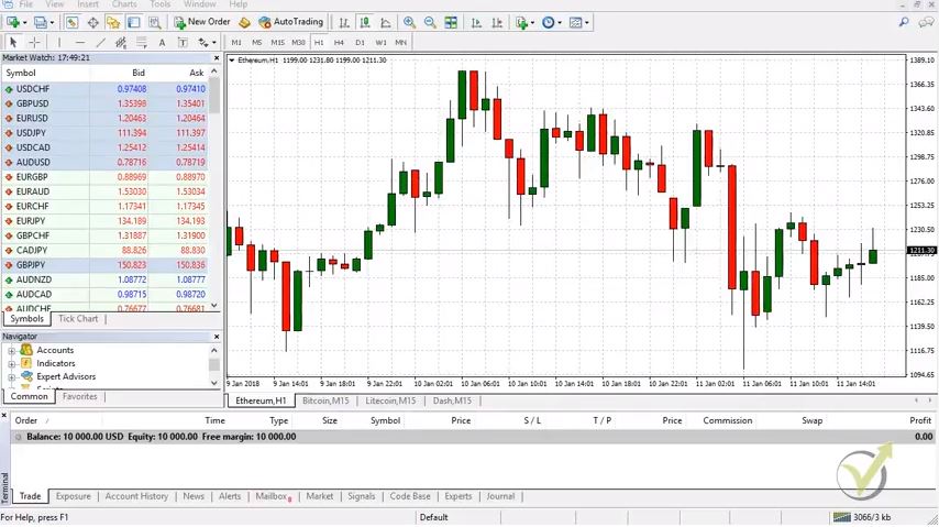
If I just zoom in any of the cryptocurrency, let me make it a little bit bigger. The first and most common type of chart are the candlesticks or they call them as well Japanese candlesticks. They were developed during 18th century by Munehisa Homma. Who was a Japanese rise trader.
And later on they were described in the book Japanese candlestick chart techniques by Steve Nison. I think he was who actually represented these candlesticks to the Western world. And they got really famous because they are very visual, much more visual than the bars and the line that I will show you.
There are many trading strategies based on the candlestick chart, and they represent very well the market behavior. There are dozens of candlestick patterns that could be used in trading. And you can find many tables and pictures with those. They give us great signals when the price might reverse. The problem is that if you base your trading strategy on candlestick pattern, you might place most of the trades against the major direction of the price.
What we have with the candlestick chart?
Each one represents time period:
- If I zoom it each candlestick represents one hour if we are on a hourly chart;
- if we go to H4 each candlestick chart represents four hours;
- and if I go to daily obviously each candlestick will represent daily chart.
If I put the mouse on the closing of every bar or let’s take yesterday because we are on the current day, if I take yesterday and if I put it on the closing you will see that I have four values. This is:
- the open
- the high
- the low
- the close
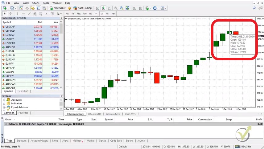
If I take this day for example there is a green body and there are two lines up and down. The body represents the distance between the opening and the close of the candlestick. And the lines represents the maximum the price. When during this day and the minimum the lowest level that the price reached during this day. If I put the mouse on the closing of the bar you will see that we have four values there.
We have the opening, the high, the low and the closing price. And we have the volume which we actually do not use when it comes to trading with brokers because they show the volume of their clients and not the global volume.
This bar is the distance between the opening and the close. So, this day opened at this level it went up and down, up and down and it closed at this level. It formed a positive day. Because it opened nearly at 1080 and it closed at 1140-1150 something. But it went up and down. And we can see how far it went down and how far it went up during this day.
And after that we have another day that opens and the price goes up and down and another day, and another day, and you can see today the price opened nearly at 1258 and if it closed below this level it will form a red candlestick chart which means it’s a negative day.
The very important things we have here with the candlesticks are the open, the closed, the high and the low of each candlestick chart.
And if you’re on a daily chart each candlestick represents one day. If I go down to H1 again each one bar represents one hour. Now is 17:55 my time after five minutes a new bar will open H1 chart.
These four values are the most important information we use in algorithmic trading.
When we export Historical data from the broker, this is what we use. There are scripts to export Historical data available on our website for free. And you can use them. What you will see is that it is extremely easy to export these 4 values for each bar for the last 2 years for example. Yes, this is huge file, but with the scripts it can be done in seconds.
Anyway, when we generate, optimize or test strategies with Strategy builders, we use this 4 values. And this is the only thing we have in order to see if a strategy was profitable in the past. Of course, this causes some issues because we do not know what exactly happened inside the bar. When we are looking at the candlestick chart you, we see the body. But we do not know where the price went first. There is no way to use the lower time frames to draw us what happened in the higher time frame candlestick chart.
Lets have the example for H1. Lets have any strategy on H1 chart. What we are able to see are the four values of this bar – the open, the high, the low and the close. We do not know what happened inside this bar, even we use the M1 chart for this one hour. Yes, we have it and we can see what happened. But when we use Expert Advisors, we can not put it this way in the code.
What is the solution?
We use different time frames in the strategy builders. This means that if we are trading on H1 chart, we can set the Expert Advisor to check the lower time frames if the price goes in our direction. The other way around is possible. If we are looking to trade on M1 candlestick chart, we can set the EA to check the higher time frames. Such three strategies we have in our course Forex trading strategies from a professional trader + 5 Robots.
The other type of charts is the bar chart
It’s the very same thing here we have these vertical lines that represent the one hour. They show where the price went to the maximum and to the lowest point during this hour. And they show where the bar was open and where was closed:
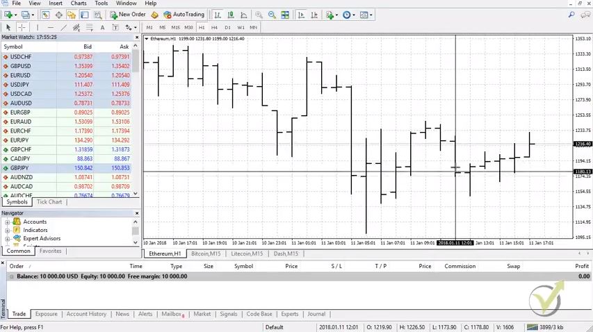
You can see there are the vertical lines. And then we have these short horizontal lines on left side of the vertical line. We have small horizontal line which represents the opening. And we have the small horizontal line on the right side which represents the closing. As you can see it’s not really visual which bar is positive and which bar is negative. If you get used with that you will know. I mean by looking at these lines, I can say vertical and horizontal lines I know very clearly which ones are positive and which ones are negative.
There are as well many strategies created over the bar chart. The interesting thing is that all of those could be applied. If we have the candlestick chart. It really does not matter which one you will use for a strategy based on it. Because it represents the very same thing, as what your eyes see.
The most useful way for every trader is the way that he is used to. I am sure that if I have started from the beginning looking and bar charts, it would be much easier to me till the moment. And I would be still using it. However, I am sure that I would have used with the candlestick chart much faster than the other way around.
The main thing is that with the bar chart we do not recognize at a first view which bars are positive and which are negative.
Something that is extremely visual with the candlestick chart. There are the different colors. If you make it white and black, you will see if immediately. Most common colors are green and red (green for positive, and black for negative), white and black (or empty which is again black if the background black).
But simply, guys, with the candlestick chart it is much more visual just from the first side even you are beginner trader it’s easy to understand which bar is negative and which bar is positive.
And the third type we have the line chart:
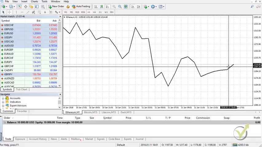
Normally the line is just connecting the closing of each bar that we see on the candlesticks or on the bars actually. It’s connecting the closing of these bars and it’s forming the line. Obviously here we have much less information. We see where the prices at what level, we see the movement. But we don’t see exactly at what hour where was the price, where were the negative and the positive hours. And it’s really hard actually to do any trading with line chart. That’s why the most common ones are the bars and the candlestick chart.
The line chart gives a bit of illusion.
Actually this line connect different points on the chart. Normally that is the closing of the predefined time. If we are on Daily, the line chart would connect the closing of each day. Or the price at which the day closed. And if we are on hourly chart it would connect the closing of each hours.
Same illusion comes with the indicators that are represented as lines. All indicators represent some formula. And there is a value as a result from the formula. So, for each bar there is a price again (different from the current). The indicators are simply lines connecting these points. This is very important to be known when we do algorithmic trading. Many traders do not understand how exactly the Expert Advisors are working exactly for this reason.
Obviously, there are other types of chart.
There are two lines that are representing the bid and ask price.
This type of chart is available with some of the brokers, but it does not help a lot. One of the lines is the bid price, and the other one is the ask price. So, you basically will see two parallel lines that move up and down. It will not be very useful to the trader. Because it is just the very same thing as the normal line chart. But still much further from the candlestick chart as information.
There are Renko charts which ignore actually the time. We have some great strategies as well with the Renko chart. The idea with the Renko chart is that they represent only the price. So, If an assets stays in a range of 20 pips for example, and you have set the Renko chart to have a new bar at every new 20 pips, you will not see any new bar opening until the price breaks these 20 pips. Anyway, this type of trading is totally different. Very different indicators, price action techniques are applied.
The strategies which are used with Renko charts are normally called “boxes”. These are the strategies where we are looking for new bar or box to open in order to enter into a trade. Pending orders are very useful in this kind of strategies. We have a great system using Renko charts, and it is in our “to do” list to put it into a course.
But the most common one is the candlestick chart. It’s much more visual and it’s much easier to be used.
This is pretty much about the different chart types. It’s your choice which one you want to use. And it really depends on the strategy that we are using with the Expert Advisors, with the robots when we do algorithmic trading. It doesn’t really matter what chart type you use. Because simply we put the trading robot over the chart. And it trades according to the entry and exit conditions. It has inside the code and it doesn’t matter what is the type chart but I will talk about the Expert Advisors in the Basic Cryptocurrency trading course – from A to Z. Also, the course is included in our PACKAGES.
For more cryptocurrency trading courses, please visit : https://eatradingacademy.com/tracks/cryptocurrency-trading/.
Thank you for reading and let me know if you have any questions at in**@************my.com or write in our FORUM on our website.

